
Let's be honest: when project deadlines are breathing down your neck, accessibility often feels like a luxury you can't afford. But here's the thing: making your eLearning accessible doesn't have to be a months-long project that derails your timeline. With the right approach, you can build accessibility into your courses quickly and efficiently.
The secret isn't doing everything perfectly from day one. It's about making smart choices that give you the biggest accessibility impact with the least time investment. Let's dive into how you can make this happen.
Start Smart: Choose Tools That Do the Heavy Lifting
The fastest way to create accessible eLearning? Don't reinvent the wheel. Modern authoring tools have evolved dramatically, and many now come with built-in accessibility features that automatically handle the technical heavy lifting for you.
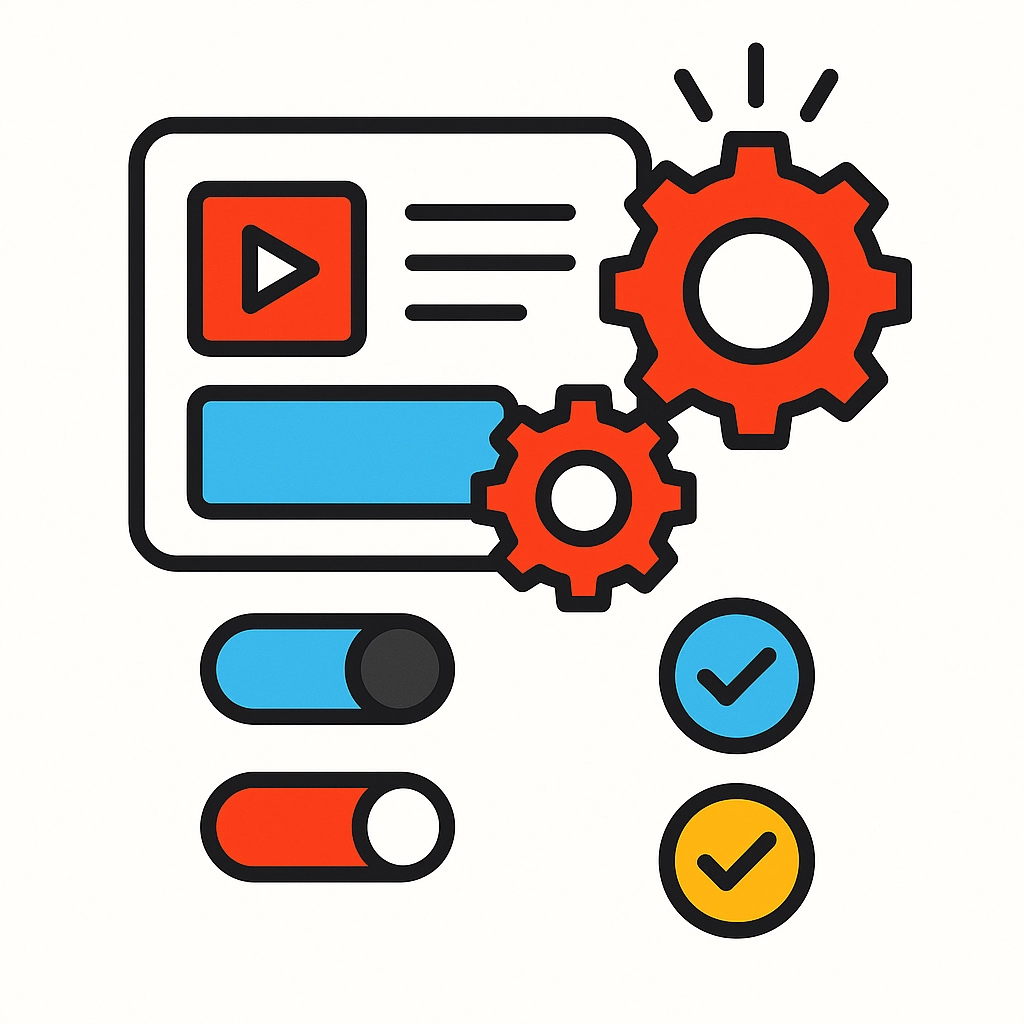
Tools like Easygenerator support WCAG 2.0 and Section 508 standards right out of the box. They automatically ensure sufficient color contrast across all design themes, provide keyboard navigation support, and make it simple to add alt text to images. This means you're not starting from scratch: you're building on a foundation that's already accessible.
iSpring Suite takes this concept even further with their Accessibility Mode functionality. Learners can switch to an accessible format with a single click, instantly getting more perceivable text, a minimalistic layout, and screen-reader-friendly content. Instead of creating multiple versions of your course, the tool does it automatically.
For comprehensive coverage, consider platforms like Intellum's Evolve Content Authoring Tool, which offers over 40 different components already certified for WCAG 2.1 standards. When your building blocks are already accessible, your final product will be too.
The bottom line? Spending a few extra minutes researching authoring tools upfront can save you weeks of manual accessibility work later.
Focus on the Big Three: Color, Text, and Navigation
When time is tight, prioritize the accessibility fixes that impact the most learners. These three areas will give you the biggest bang for your buck:
Color Contrast
Poor color contrast is one of the most common accessibility barriers, affecting learners with visual impairments and anyone using their device in bright environments. The good news? It's also one of the easiest to fix.
Most modern authoring tools include contrast checkers, or you can use free online tools to verify your color combinations meet WCAG standards. If you're using pre-designed themes, many already have proper contrast built in: just stick with the recommended color palettes.

Alternative Text for Images
Every image in your course needs descriptive alt text so screen readers can convey the information to visually impaired learners. The key is writing alt text that describes the purpose of the image, not just what it looks like.
Instead of "graph with bars," write "Sales increased 25% from Q1 to Q2, shown in blue and orange bars." This takes seconds per image but makes a huge difference for accessibility.
Keyboard Navigation
Many learners can't use a mouse and rely on keyboard navigation instead. Test your course by unplugging your mouse and navigating through everything using only the Tab key. Can you access all buttons, links, and interactive elements? If not, your authoring tool should have settings to fix this quickly.
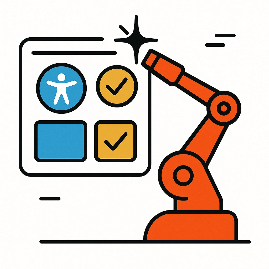
Leverage Automation Where Possible
Here's where you can really save time: let technology do the work for you. Many accessibility issues can be caught and fixed automatically, freeing you up to focus on content quality.
Automated Accessibility Testing
Instead of manually checking every element, use automated testing tools to scan your course for common accessibility issues. These tools can identify missing alt text, color contrast problems, and navigation issues in minutes rather than hours.
Template-Based Development
Start with accessible templates instead of building from scratch. If your authoring tool offers pre-designed templates that meet accessibility standards, use them. You can customize the content while maintaining the accessible structure.
Bulk Actions
When adding alt text or making other repetitive accessibility improvements, look for bulk editing features in your authoring tool. Being able to update multiple elements at once can turn a day-long task into a 30-minute one.
Streamline Your Testing Process
Comprehensive accessibility testing can take weeks, but you don't need to test everything to catch the most critical issues. Focus your testing efforts where they'll have the biggest impact.
The 80/20 Rule for Accessibility Testing
Twenty percent of your testing effort can catch 80% of accessibility issues. Focus on:
- Main navigation and menu systems
- Key interactive elements like quizzes and buttons
- Critical learning paths through your course
- Any custom components you've created
Hybrid Testing Approach
Combine automated testing with targeted manual testing. Run automated scans to catch technical issues, then manually test the most important user journeys using only keyboard navigation or screen reader software.
Real User Feedback
If possible, get quick feedback from users who actually rely on accessibility features. Even 15 minutes with someone who uses a screen reader can reveal issues that technical testing might miss.
Quick Wins That Make a Big Difference
Some accessibility improvements take minutes to implement but significantly enhance the learning experience:
Descriptive Link Text
Instead of "click here" or "read more," use descriptive link text like "download the project template" or "view the case study results." Screen reader users often navigate by jumping between links, so descriptive text helps them understand where each link leads.
Clear Heading Structure
Use proper heading hierarchy (H1, H2, H3) to create a logical content structure. Screen readers use headings to navigate content, so a clear hierarchy makes your course much easier to follow.
Captions for Video Content
If your course includes videos, adding captions helps not just learners with hearing impairments, but also those in noisy environments or non-native speakers. Many video platforms now offer automated captioning that you can quickly review and edit.
Building Accessibility Into Your Workflow
The fastest approach long-term is making accessibility part of your standard development process rather than an afterthought. Here's how to do it without adding complexity:
Accessibility Checklist
Create a simple checklist of accessibility requirements that you review before publishing any course. Include items like "all images have alt text," "color contrast meets standards," and "keyboard navigation works throughout."
Template Library
Build a library of accessible templates and components that your team can reuse. Once you've created an accessible quiz template or navigation system, you can use it across multiple courses without starting from scratch each time.
Quick Review Process
Build a 15-minute accessibility review into your quality assurance process. This quick check can catch most issues before they reach learners, saving you from having to fix them later.
The Reality Check: Progress Over Perfection
Perfect accessibility takes time, but good accessibility doesn't have to break your timeline. The goal is creating learning experiences that work for as many people as possible, not achieving 100% compliance on day one.
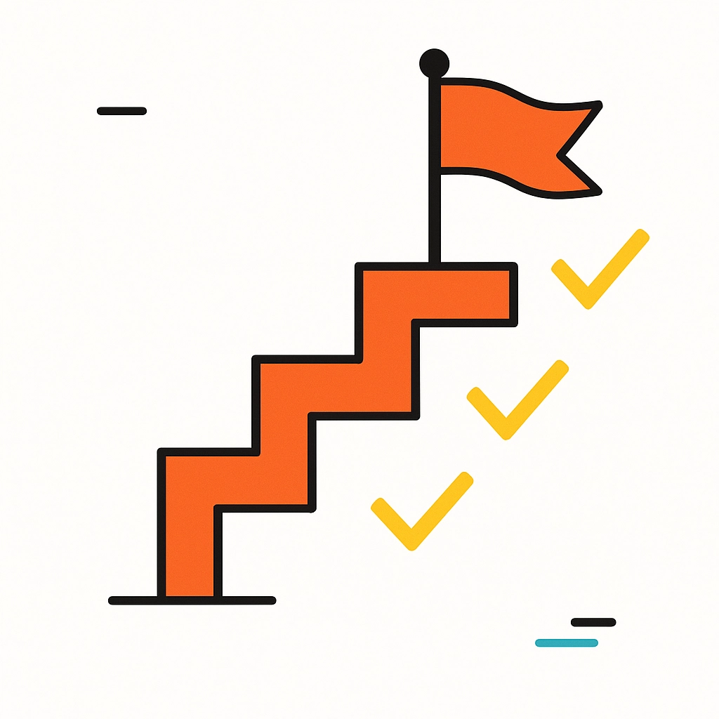
Start with the high-impact improvements we've discussed, then continue enhancing accessibility in future iterations. Your learners will benefit immediately from the improvements you make today, and you can build on that foundation over time.
Remember, accessible design often benefits everyone, not just learners with disabilities. Clear navigation helps all users find content faster. Good color contrast improves readability in various lighting conditions. Keyboard navigation makes courses usable on different devices.
By choosing the right tools, focusing on high-impact improvements, and building accessibility into your workflow, you can create inclusive learning experiences without derailing your project timeline. The key is starting smart and staying consistent: your learners will thank you for it.
Ready to make your next eLearning project more accessible? Start with choosing an authoring tool with built-in accessibility features, focus on color contrast and alt text, and remember that progress beats perfection every time.