
Creating accessible eLearning courses in 2025 isn’t just about checking boxes for compliance—it’s about thoughtful, inclusive design that unlocks learning for everyone. The right approach helps all your learners, whether they live with disabilities, process information differently, or just want options in how they engage. As tech advances push the boundaries for inclusion, an accessible course doesn’t just do good—it stands out as something awesome!
Why Accessibility Is Essential in 2025
If you’re creating eLearning today, accessibility is a non-negotiable. Here’s why:
- Accessibility is top of mind. Accessible design signals to every learner: “You belong here.”
- Technology and expectations have evolved. Modern learners use AI tools, personalized apps, VR headsets, and more. They expect equally seamless access—no matter their device or ability.
- Laws and rules are tightening. New U.S. Department of Justice rulings require public-facing sites and apps to be accessible, and similar rules are rolling out worldwide. Being proactive isn’t just smart; it’s required.
- Global audiences need flexible solutions. Learning is borderless—your course might be used by people with diverse languages, cultures, and needs.
Accessible design future-proofs your eLearning, making it easier to expand, update, and serve new learners. When you’re planning your next course, bake accessibility into every layer for the biggest impact.
Principles of Accessible eLearning Design
Accessible courses have a lot in common: they’re clear, flexible, and built with empathy. Here’s what to prioritize from day one:
Start With “Born Accessible” Content
Designing for everyone from the start is always easier (and less expensive) than retrofitting accessibility later. Think inclusively, plan for a wide range of needs, and make your default design accessible.
- Write clear, straightforward instructions, avoiding jargon.
- Use simple, consistent layouts instead of cluttered pages.
- Organize content logically (headers, lists, chunked sections) to support both visual learners and screen reader users.
- Test color choices for contrast and avoid relying solely on color to convey meaning.
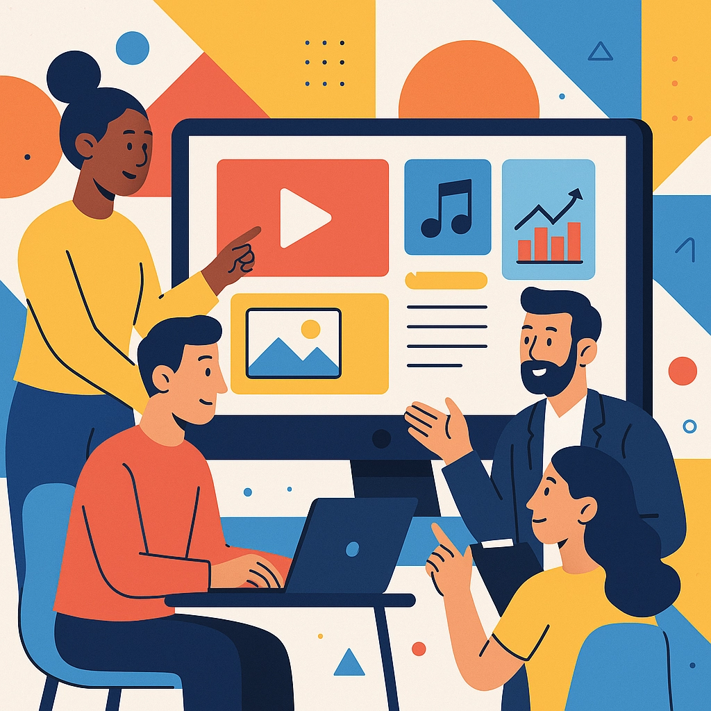
Make Multimedia Universally Accessible
Today’s courses use tons of multimedia—videos, audio clips, graphics, simulations. That’s great for engagement, but each piece needs to be usable for all.
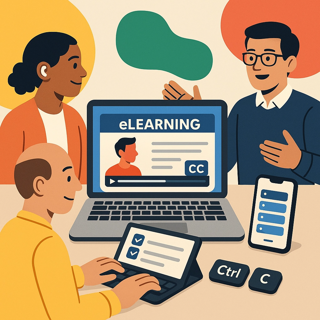
For Videos:
- Provide captions that are accurate, well-timed, and available directly in the video player.
- Add audio descriptions if visual information is critical (for example, describing a chart’s action on screen).
- Use transcripts for learners who prefer to read or need to translate content.
For Audio:
- Publish complete transcripts, not just a summary. Include non-verbal cues (music, tone, etc.) when important for meaning.
For Visuals:
- Describe all images, charts, and diagrams with meaningful alternative text (alt text)—not just "image" or "chart."
- For complex visuals, offer a longer text summary or data table.
- Clearly mark any decorative graphics as such, so screen readers skip them.
Design for All Types of Learners
Accessibility is about more than just vision or mobility—it’s for cognitive, sensory, and language variety too.
- Give users control over navigation: let them pause, skip, or replay activities.
- Use plain language, break up text with headings and lists, and define specialized terms in a glossary.
- Allow keyboard-only navigation throughout your course. Not everyone uses a mouse!
- Avoid auto-advancing slides or audio—give learners plenty of time and control.
- Provide multiple ways to interact with content: drag-and-drop, typing, speaking aloud, quizzes with various formats.
Technical Standards That Matter: Section 508, WCAG & ADA
The world of accessibility standards has a lot of acronyms, but don’t be intimidated—they’re built on common-sense guidelines:
- Section 508: U.S. federal standard for public sector accessibility. If your clients are in government, you must comply. Most public eLearning today aims to meet or exceed these requirements.
- WCAG: The industry gold standard (currently at WCAG 2.2), which is internationally recognized and often legally referenced. A few highlights:
- Text must be resizable up to 200% with no loss of content or function.
- There must be sufficient contrast for all text (usually at least 4.5:1).
- All functionality (including quizzes and drag-and-drop) must be accessible by keyboard.
- Content should work predictably with assistive tech like JAWS, NVDA, or VoiceOver.
- ADA: The Americans with Disabilities Act isn’t just for physical spaces—it also governs digital ones, especially for businesses and educational institutions.
For more information or to view a sample virtual instructor-led training, view Section 508 accessibility guide.
Implementation Strategies That Work
Great accessible design is everyone’s job! Here’s how to make it happen in real life:
Smarter Authoring
- Use eLearning tools with built-in accessibility features (like Articulate Storyline, iSpring Suite, or Adobe Captivate). These provide accessibility checklists and make alt text, tab order, and captions easier to manage.
- If starting in PowerPoint, take advantage of built-in accessibility checkers and templates.
- Check your layout in both desktop and mobile views—many learners will use phones or tablets first.
Mobile-Ready, Cross-Platform Design
Courses must look—and function—perfectly on every device. That means:
- Responsive layouts that adapt to small screens.
- Larger, easy-to-tap buttons.
- Lightweight files for fast loading (especially important for learners using assistive tech that’s resource intensive).
- All interactivity must work with touch, keyboard, or mouse.
Thinking About the LMS
Choosing the right learning platform (LMS) makes a huge difference for accessibility:
- Look for an LMS with accessible navigation, screen reader compatibility, and customizable appearance.
- Features like discussion boards, notifications, and assessments should be just as easy to use for everyone.
- Test every major workflow (enrolling, submitting, reviewing) with assistive tech.
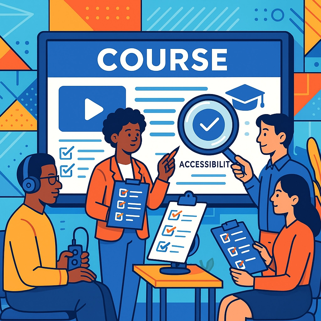
Testing, Quality, and Continuous Improvement
Accessible design isn’t a one-and-done—they need regular checks and updates.
- Audit your courses: use automated checks, then have real users (especially those with disabilities) test them.
- Check captions, alt text, keyboard navigation, and color contrast.
- Train your team (and any subject matter experts) to recognize accessibility gaps before they publish new materials.
- Create a routine for reviewing and updating resources—especially if you add new media or lessons on a tight deadline.
The Universal Win: Accessibility Benefits Everyone
The best-kept secret? When you design for accessibility, your course becomes better for all.
- Captions and transcripts help busy professionals, language learners, and those with poor connectivity.
- Logical navigation and clean design reduce cognitive load for everyone.
- Accessible design helps people who don’t openly share their disabilities, temporary injuries, or simply their learning preferences.
When you champion accessibility, your course shines—diverse learners thrive, outcomes improve, and your content stands out in a crowded digital world.
Looking for support to take your eLearning to the next level of accessibility and greatness? ABK Learning Solutions is ready to help you build learning that’s accessible and awesome for every user in 2025 and beyond!